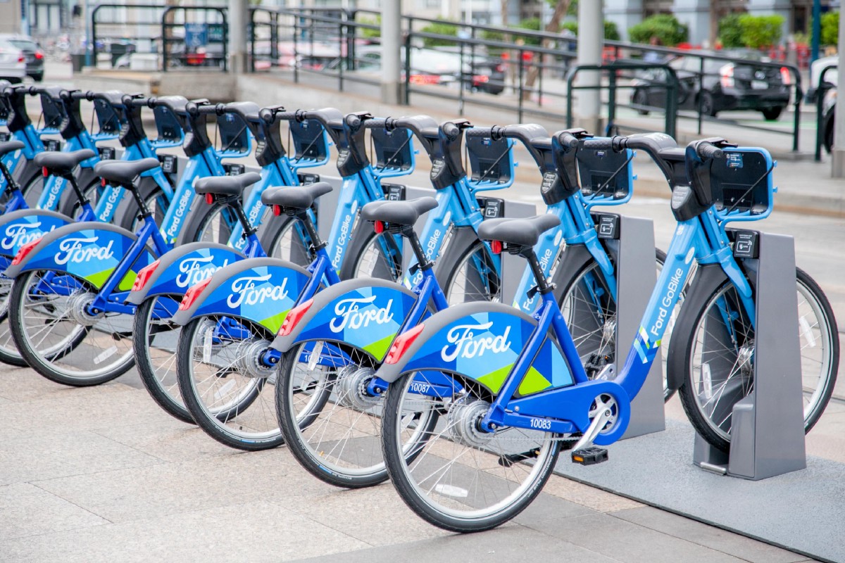
Using Python packages such as Pandas, Matplotlib, and Seaborn... I have studied 2 million data points from the Ford GoBike bike-sharing system, where I have visualized trends that show most subscribers use the service as part of their daily routine to drive to work.
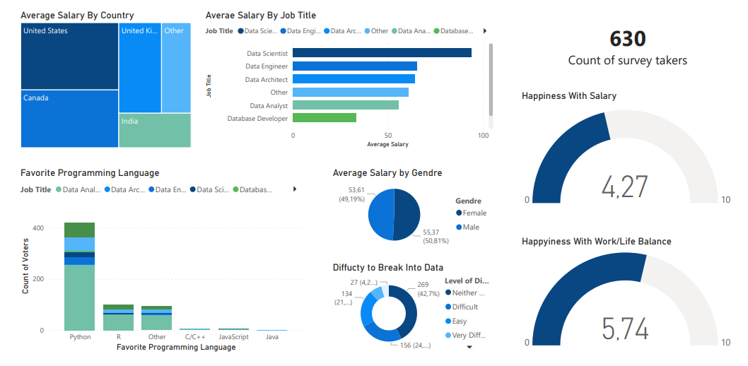
The dataset contains 630 survey responses by data professionals from various fields around the world, reflecting their work life satisfaction, practices, etc.
This Power BI visualization focuses more on the level of happiness, salary satisfaction, and difficulty to break into the technology field by gender, country, and sector.
Be sure to download the full survey responses and refine your own visualization.

The dataset collected information on 100,000 medical appointments in Brazil with 12 columns that indicated age, neighborhood, and SMS reception... after long hours of analysis since the data showed a normal distribution between the variables, I identified a good reason why this 20% of patients miss their appointments, which is the long waiting period (months) until the scheduled day, which could lead the patient to other alternatives so that he/she no longer needs the appointment.

This project was a part of the data wrangling section of the Udacity Data Analyst Nanodegree program and it mainly focuses on collecting data from different sources, including the WeRateDogs Twitter account.
The main section of the project was the data cleaning phase, where we had to extract data points from the actual tweet text and ensure that the dataset is tidy enough for a proper analysis.